Zoo Flyer
Fall 2018
Project Objective:
To create an educational take-home flyer aimed at 6-12 year olds who visit the zoo. It’s restricted to a two color print and must include a pattern.
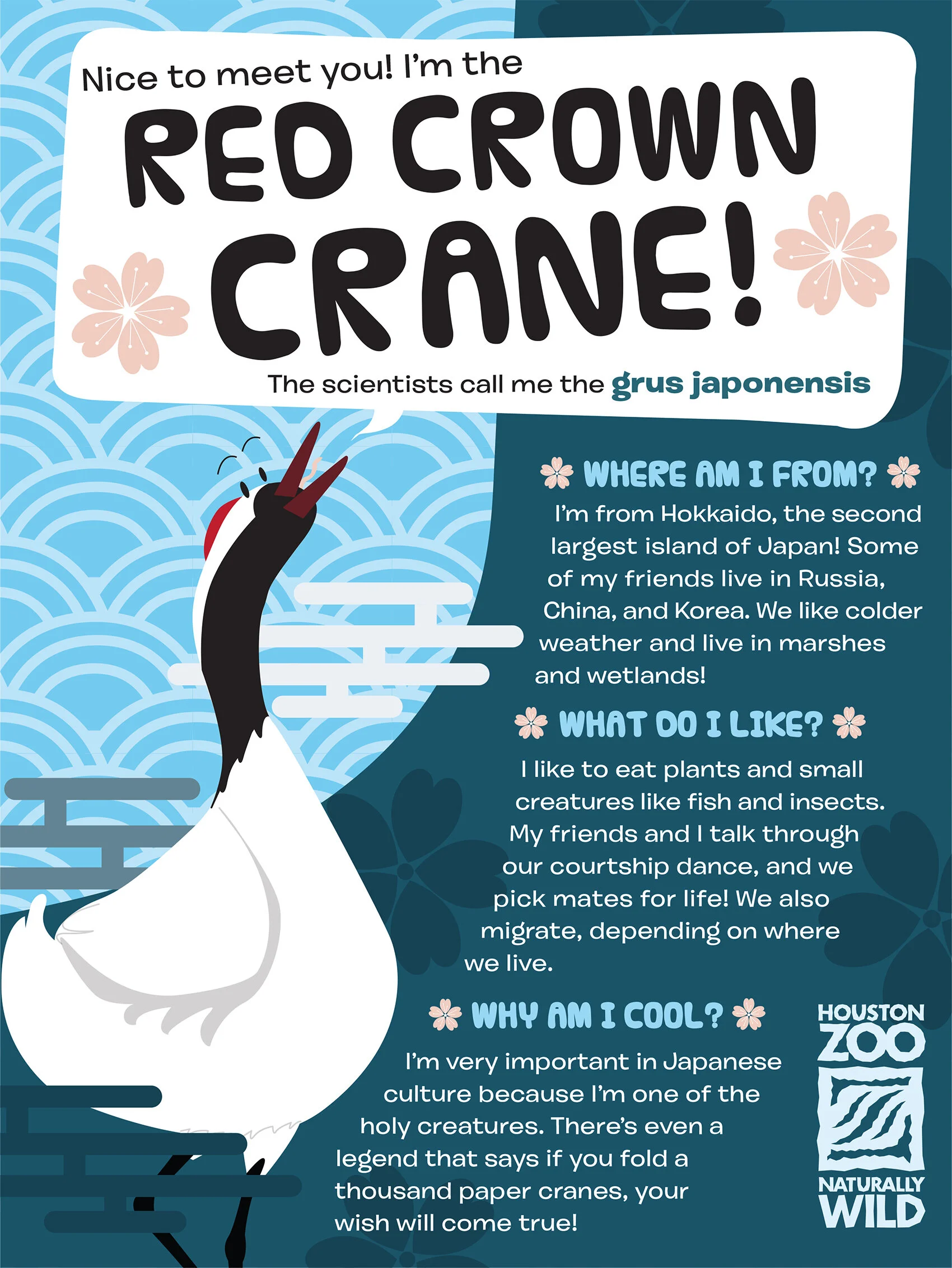
To be friendly and engaging to a younger audience, I made the crane a character of sorts, acting as if the crane is the one talking to the viewer. This informed the body text as well, with language that was friendly and enthusiastic to engage the reader, as well as keeping to smaller, easier to understand chunks of text. The fun display font and the san-serif body text are easy to understand to allow for comprehension in younger audiences.
The wave pattern is referenced from East Asian patterns, as the crane is symbolic in many Asian cultures and I wanted to allude to that connection—same with the cherry blossom illustrations. The slight curve of the large blue also references the wave pattern, as does the text. The two colors I chose were red and blue, allowing me to use pink in the blossoms and different tints and shades of the blue to create contrast with the white body of the crane and text.
Programs Used:
Illustrator