Water Lillies
Monet’s Cafe
Water Lillies is a small cafe inspired by famous French painter Claude Monet.
Here is my design process for the whole 6 week project.
Setting the Mood
Water Lillies first began as simple extractions of Monet’s famous water lily paintings but it soon grew into a small, elegant, and calming cafe setting. To begin the design process, I put together two moodboards reflecting the color schemes, patterns, line quality, architecture, decorations, and general mood I wanted to create for this cafe. I drew heavy inspiration from Monet’s and impressionism’s fascination with capturing light as well as capturing the moment.


Putting a Name to a Cafe
Next was designing the logo and finalizing the brand colors.
Beginning the Logo
I knew I was going to extrapolate from Monet’s water lily paintings but I was unsure how to capture the elegance and beauty of his work, and so I focused on simplifying the key components that capture the eye.
I took broad samples of his most used colors and simplified them into five key colors. From there, I picked the two colors that best invoked the image of a water lily—pinks and greens.
For the mark I simplified the water lily flower into minimal lines, knowing I wanted the type to mimic the thin lines as well. I played with different script fonts but many of them lacked readability at smaller sizes so I scrapped them and turned towards serif and san-serifs.


Hierarchy + The Final Mark
The logos I developed that worked the best were those that had clear hierarchy within the typography, and so I heavily focused on designs with clear typographic hierarchy. I kept the logo mark prominent in the design as well, knowing that part of my branding would be to have the mark alone at times.
Pauline
Avenir Condensed
Putting the Logo to Use
Now that I had a logo that fit the mental image of my cafe, it was time to design the rest of the branding system.
Business System
Cafe Collateral
Not only did I focus on the internal branding of the cafe, I also focused on the external collateral as well. From cafe merchandise to advertisements, I kept a uniform look and feel to all future designs to develop the brand even further.


Coasters
I wanted a dual use for the coaster designs within the cafe, not just for branding purposes but for use by the customer and staff to recognize if someone wanted a refill or if they were done with a drink.
To achieve this I used the two contrasting brand colors to signify the two different drink states—petal pink for “no refill” and leaf green for “refill.”
Instagram Ad
A short instagram ad to promote the cafe. For this I used imagery of people enjoying food similar to the food served at the cafe, as well as using an upbeat song to make the viewer feel
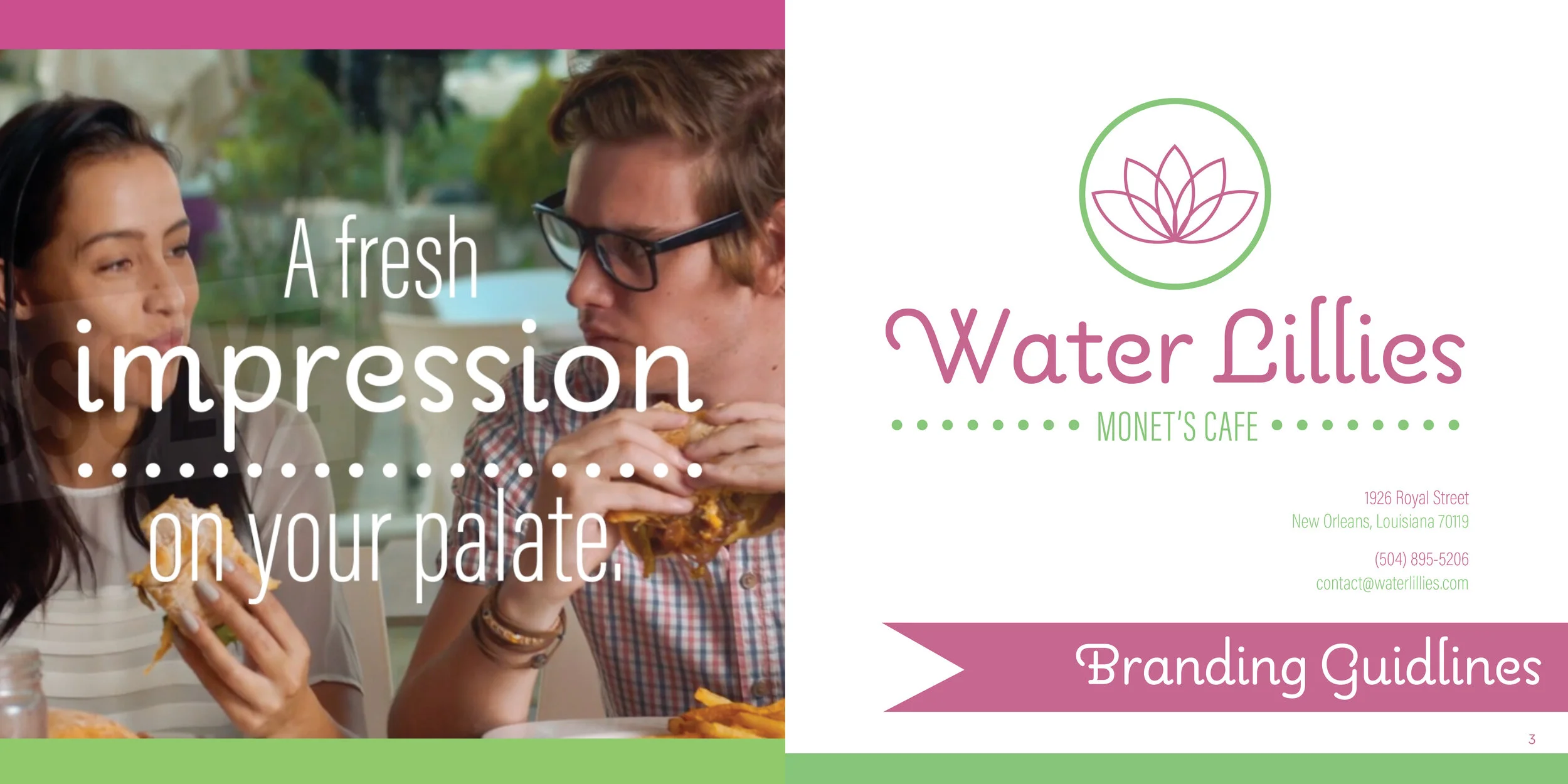
Water Lillies Branding Guide
All of the final designs culminated into this handy branding guide for the cafe. It’s a 6” x 6,” twenty page catalog that outlines the basics of the brand design I developed.


